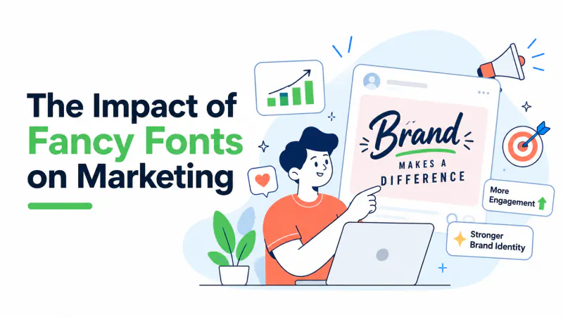
Type does a lot of quiet work in marketing. Before anyone reads your words, they've already formed an impression from how those words look. Fancy fonts can help a post or profile get noticed, but only if they're used with some care.
First impressions
People scroll fast. A line of styled text in a feed of plain captions breaks the pattern and can earn a second look. That's the main thing fancy fonts offer in marketing: a little visual contrast in places where you otherwise have none.
Recognition comes from consistency
One styled post won't build a brand. Using the same one or two styles across your bio, captions and highlights over time will, because people start to associate that look with you. Pick styles that suit your brand and keep them, rather than trying a new one every week.
Attention isn't the same as readability
The styles that grab attention are often the hardest to read. A heading in heavy gothic letters might stop the scroll, but if the offer underneath is also in gothic, people won't read it. Style the hook, then write the message in plain text.
What a style says about you
Styles carry a tone. Script feels personal and soft, bold sans-serif feels direct, gothic feels edgy, and bubble letters feel playful. Match the style to what you're saying. A playful style on a serious announcement sends a mixed message.
Where it fits in a campaign
- Good fits: bio name lines, the first line of a caption, launch headlines in posts, and highlight or section labels.
- Poor fits: hashtags and handles (styled letters break search and tags), prices, dates and contact details.
- Paid ads: check the platform's rules first. Google Ads, for example, rejects ads that use symbols or non-standard characters in gimmicky ways.
Used this way, styled text is a small, free way to make organic posts more recognisable. The bold font generator is a safe place to start, because bold styles stay readable almost everywhere.